Real-time outbreak analysis: Ebola as a case study - part 3
Introduction
This practical is the third (and last) part of a practical which
simulates the early assessment and reconstruction of an Ebola Virus
Disease (EVD) outbreak. Please make sure you have gone through part
1 and part
2 before starting part
3. In part 3 of the practical, we give an
introduction to transmission chain reconstruction using outbreaker2.
Note: This practical is derived from earlier practicals called Ebola simulation part 1: early outbreak assessment and Ebola simulation part 2: outbreak reconstruction
Learning outcomes
By the end of this practical (part 3), you should be able to:
- Use the
outbreaker2package to reconstruct who infected whom using epidemiological and genetic data - Understand how different types of data contribute to our understanding of who infected whom
- Interpret the various outputs from
outbreaker2, and understand the uncertainty associated with any conclusions you draw - Visualise a consensus tree using epicontacts
Context: A novel EVD outbreak in a fictional country in West Africa
A new EVD outbreak has been notified in a fictional country in West
Africa. The Ministry of Health is in charge of coordinating the outbreak
response, and have contracted you as a consultant in epidemic analysis
to inform the response in real time. You have already done descriptive
and statistical analyses of the data to understand the overall epidemic
trend (part 1 and part
2 of the practical). Now we will try and
draw a more detailed picture of the epidemic by trying to infer who
infected whom using the data available to us, namely dates of symptom
onset, whole genome sequences (WGS) and limited contact data. This can
be achieved using outbreaker2, which provides a modular platform for
outbreak reconstruction.
Required packages
The following packages, available on CRAN or github, are needed for this analysis. You should have installed them in part 1 and part 2 but if not, install necessary packages as follows:
# install.packages("remotes")
# install.packages("readxl")
# install.packages("outbreaks")
# install.packages("incidence")
# remotes::install_github("reconhub/epicontacts@ttree")
# install.packages("distcrete")
# install.packages("epitrix")
# remotes::install_github("annecori/EpiEstim")
# remotes::install_github("reconhub/projections")
# install.packages("ggplot2")
# install.packages("magrittr")
# install.packages("binom")
# install.packages("ape")
# install.packages("outbreaker2")
# install.packages("here")Once the packages are installed, you may need to open a new R session. Then load the libraries as follows:
library(readxl)
library(outbreaks)
library(incidence)
library(epicontacts)
library(distcrete)
library(epitrix)
library(EpiEstim)
library(projections)
library(ggplot2)
library(magrittr)
library(binom)
library(ape)
library(outbreaker2)
library(here)Read in the data processed in part 1 and part 2
linelist <- readRDS(here("data/clean/linelist.rds"))
linelist_clean <- readRDS(here("data/clean/linelist_clean.rds"))
epi_contacts <- readRDS(here("data/clean/epi_contacts.rds"))
si <- readRDS(here("data/clean/si.rds"))Importing Whole Genome Sequences (WGS)
WGS have been obtained for all cases in this outbreak. They are stored
as a fasta
wgs_20140707.fasta.
Download this file, save it in your working directory, and then import
these data using the function read.FASTA from the ape package. Do
the sequence labels match the IDs in your cleaned linelist?
dna <- read.FASTA(here("data/wgs_20140707.fasta"))
dna## 169 DNA sequences in binary format stored in a list.
##
## All sequences of same length: 18967
##
## Labels:
## d1fafd
## 53371b
## f5c3d8
## 6c286a
## 0f58c4
## 49731d
## ...
##
## Base composition:
## a c g t
## 0.244 0.252 0.249 0.254
## (Total: 3.21 Mb)
identical(labels(dna), linelist_clean$case_id) # check sequences match linelist data## [1] FALSE
Subset the genetic data to keep only the sequences that match your cleaned linelist, and check again that the sequence labels match.
dna <- dna[match(linelist_clean$case_id, names(dna))]
identical(labels(dna), linelist_clean$case_id)## [1] TRUE
Building delay distributions
outbreaker2 can handle different types of dates. When dates of onset
are provided, information on the generation time (delay between
primary and secondary infections) and on the incubation period (delay
between infection and symptom onset) must be provided. For this
practical we will assume that the generation time can be approximated
using the serial interval, which you have already estimated above and
stored in the object si.
How are the generation time and serial interval related? How might they differ?
- the generation time is the delay between infection times of transmission pairs, whereas the serial interval is the delay between times of symptom onset
- the serial interval captures the delay between infection times and the delays from infection times to symptom onset
- the serial interval distribution therefore generally has a larger variance than the generation time distribution
The incubation period can be estimated from the linelist data by calculating the delay between dates of symptom onset and dates of infection, which are known for some cases. Visualise the distribution of incubation periods using a histogram.
incub_obs <- as.integer(na.omit(with(linelist_clean, date_of_onset - date_of_infection)))
summary(incub_obs)## Min. 1st Qu. Median Mean 3rd Qu. Max.
## 1.000 4.000 5.000 8.019 10.000 37.000
hist(incub_obs, breaks = 0:40,
xlab = "Days after infection", ylab = "Frequency",
main = "Incubation period (empirical distribution)",
col = "grey", border = "white")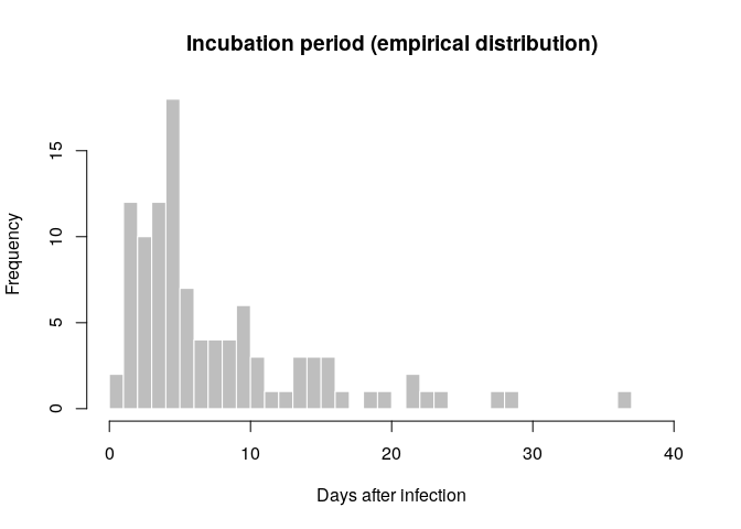
As for the serial interval, use the function fit_disc_gamma to fit a
Gamma distribution to these empirical estimates.
incub_fit <- fit_disc_gamma(incub_obs)
incub_fit## $mu
## [1] 8.518541
##
## $cv
## [1] 0.6840563
##
## $sd
## [1] 5.827161
##
## $ll
## [1] -309.7443
##
## $converged
## [1] TRUE
##
## $distribution
## A discrete distribution
## name: gamma
## parameters:
## shape: 2.13705814653622
## scale: 3.98610612672765
incub <- incub_fit$distributionCompare this distribution to the empirical data to make sure the results seem reasonable:
hist(incub_obs, xlab = "Days after infection", ylab = "Frequency",
main = "Incubation period: fit to data", col = "salmon", border = "white",
50, ylim = c(0, 0.15), freq = FALSE, breaks = 0:40)
points(0:60, incub$d(0:60), col = "#9933ff", pch = 20)
points(0:60, incub$d(0:60), col = "#9933ff", type = "l", lty = 2)
An alternative approach here would be to use estimates of the mean and
standard deviation of the incubation period and the generation time
published in the literature. From this, one would need to use epitrix
to convert these parameters into shape and scale for a Gamma
distribution, and then use distcrete to generate discretised
distributions.
Using the original outbreaker model
The original outbreaker model combined temporal information (here,
dates of onset) with sequence data to infer who infected whom. Here, we
use outbreaker2 to apply this model to the data.
All inputs to the new outbreaker function are prepared using dedicated
functions, which make a number of checks on provided inputs and define
defaults. Make sure you names the dates vector, so the DNA labels can be
linked to their respective cases:
dates <- linelist_clean$date_of_onset
names(dates) <- linelist_clean$case_id
data <- outbreaker_data(dates = dates, # dates of onset
dna = dna, # WGS
w_dens = si$d(1:100), # generation time distribution
f_dens = incub$d(1:100) # incubation period distribution
)We also create a configuration, which determines different aspects of
the analysis, including which parameters need to be estimated, initial
values of parameters, the length of the MCMC, etc. If you want see a
progress bar to indicate how long the analysis will take, add an
additional option pb =
TRUE:
ob_config <- create_config(move_kappa = FALSE, # don't look for missing cases
move_pi = FALSE, # don't estimate reporting
init_pi = 1, # set reporting to 1
find_import = FALSE, # don't look for additional imported cases
init_tree = "star" # star-like tree as starting point
)We can now run the analysis. This should take a couple of minutes on
modern laptops. Note the use of set.seed(0) to have identical results
across different users and computers:
set.seed(0)
res_basic <- outbreaker(data = data, config = ob_config)
res_basic##
##
## ///// outbreaker results ///
##
## class: outbreaker_chains data.frame
## dimensions 201 rows, 506 columns
## ancestries not shown: alpha_1 - alpha_166
## infection dates not shown: t_inf_1 - t_inf_166
## intermediate generations not shown: kappa_1 - kappa_166
##
## /// head //
## step post like prior mu pi eps lambda
## 1 1 -4212.492 -4214.795 2.302485 1.000000e-04 1 0.5 0.05
## 2 50 -1195.248 -1197.551 2.302578 6.670115e-06 1 0.5 0.05
## 3 100 -1172.138 -1174.441 2.302578 6.670115e-06 1 0.5 0.05
##
## ...
## /// tail //
## step post like prior mu pi eps lambda
## 199 9900 -1123.955 -1126.258 2.30258 4.851635e-06 1 0.5 0.05
## 200 9950 -1131.066 -1133.369 2.30258 4.851635e-06 1 0.5 0.05
## 201 10000 -1156.391 -1158.694 2.30258 4.851635e-06 1 0.5 0.05
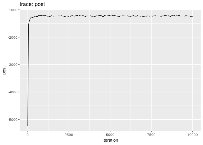
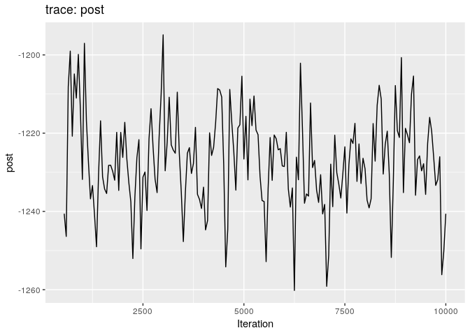
plot(res_basic)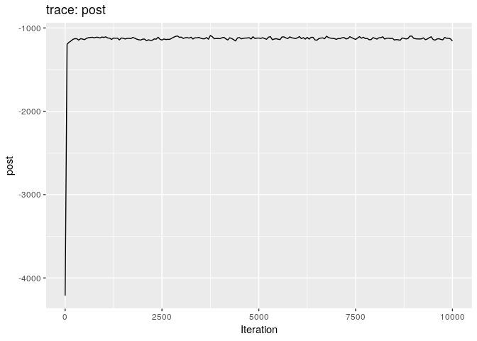
plot(res_basic, burn = 500)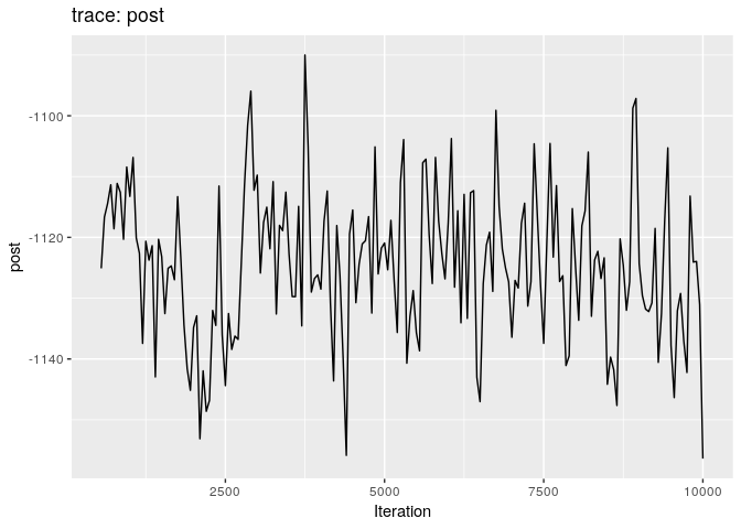
The first two plots show the trace of the log-posterior densities (with,
and without burnin). See ?plot.outbreaker_chains for details on
available plots. Graphics worth looking at include:
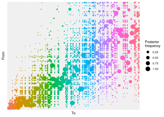
## ancestry plot
## axis labels are removed because they are too small to make out
plot(res_basic,
type = "alpha",
burnin = 500) +
theme_minimal() +
theme(axis.text = element_blank(),
axis.ticks = element_blank())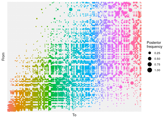
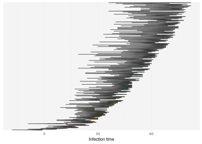
## infection dates
plot(res_basic,
type = "t_inf",
burnin = 500) +
theme_minimal() +
theme(axis.text.y = element_blank(),
axis.ticks.y = element_blank())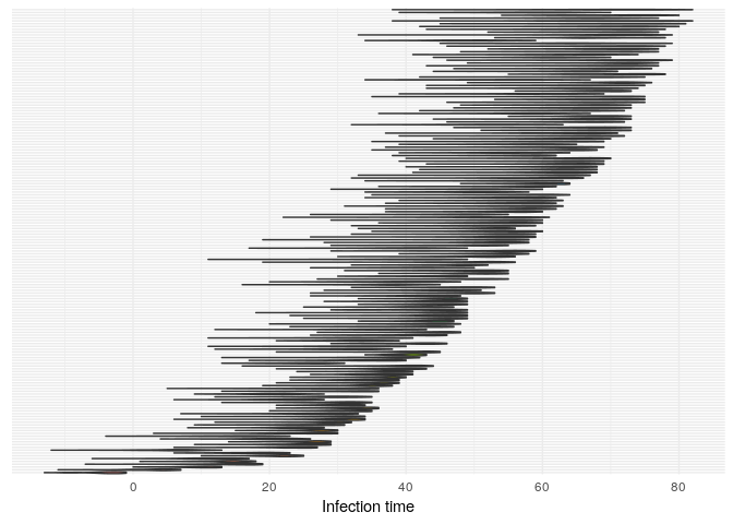
# mutation rate
plot(res_basic, "mu", burn = 500, type = "density")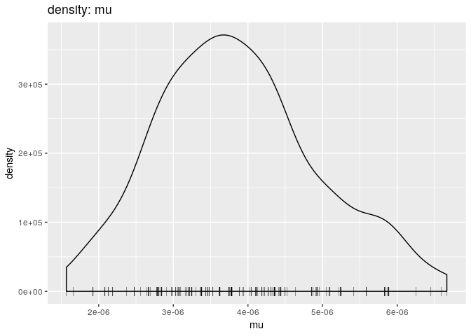
# transmission trees
p <- plot(res_basic,
type = "network",
burnin = 500,
min_support = .05)
pExplain briefly what each of these plots shows, and what (if any) conclusions can be drawn from them.
- The
alphaplot shows the posterior probability of one case infecting another. Some ancestries are clearly well resolved (large circles), whereas others are not. The clustering of circles into rectangles suggests there are clusters of unresolved cases (in this case, the genetically identical cases) - The
t_infplot shows the posterior distribution of infection times. For most cases, this distribution is quite flat - The
muplot simply shows the posterior distribution of mutation rate estimates. It is unimodal around 6e-6 - The
networkplot shows a network of likely infectious relationships between cases. You can see the clustering of cases that correspond to genetically identical cases.
As a further help for interpretation, you can derive a consensus tree
from the posterior samples of trees using summary. Look in particular
at the support column.
smry_basic <- summary(res_basic)
head(smry_basic$tree)## from to time support generations
## 1 NA 1 -4 0.04477612 NA
## 2 1 2 4 0.75124378 1
## 3 9 3 10 0.34825871 1
## 4 9 4 15 0.21890547 1
## 5 8 5 14 0.21393035 1
## 6 9 6 12 0.31840796 1
tail(smry_basic$tree)## from to time support generations
## 161 107 161 70 0.04477612 1
## 162 133 162 70 0.09950249 1
## 163 103 163 67 0.19402985 1
## 164 144 164 72 0.27860697 1
## 165 99 165 59 0.06467662 1
## 166 109 166 71 0.04477612 1
hist(smry_basic$tree$support, col = "grey", border = "white",
main = "Consensus ancestry: support", xlim = c(0,1))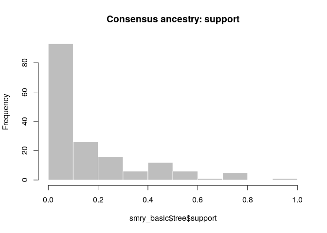
How would you interpret this result? How well resolved is the transmission tree?
- The tree is fairly poorly resolved, as most ancestries have <0.5 posterior support
- The genetic data can resolve the outbreak into clusters of identical cases, but not beyond that
As a point of comparison, repeat the same analysis using temporal data
only, and plot a graph of ancestries (type = "alpha"); you should
obtain something along the lines of:
set.seed(0)
data <- outbreaker_data(dates = linelist_clean$date_of_onset, # dates of onset
w_dens = si$d(1:100), # generation time distribution
f_dens = incub$d(1:100) # incubation period distribution
)
res_time <- outbreaker(data = data, config = ob_config)
## ancestry plot
## axis labels are removed because they are too small to make out
plot(res_time,
type = "alpha",
burnin = 500) +
theme_minimal() +
theme(axis.text = element_blank(),
axis.ticks = element_blank())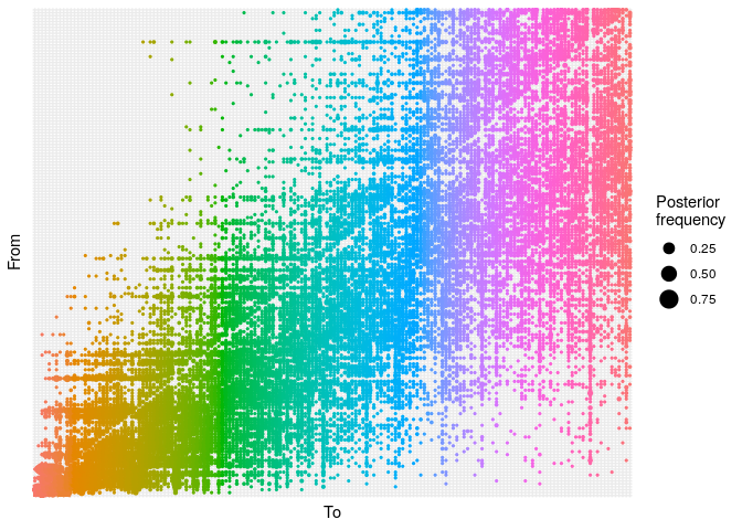
Create a consensus tree, visualise the support values and compare to
the results when using temporal and genetic data.
smry_time <- summary(res_time)
hist(smry_time$tree$support, col = "grey", border = "white",
main = "Consensus ancestry: support", xlim = c(0,1))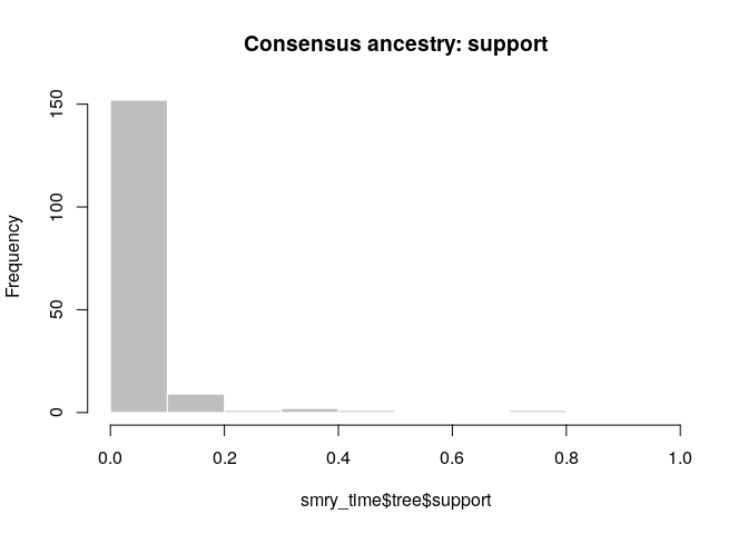
What is the usefulness of temporal and genetic data for outbreak reconstruction? What other data would you ideally include?
- Temporal data is not very informative (especially if the generation time and incubation period distributions are flat)
- Genetic data is more informative, but it depends on how large the clusters of genetically identical cases are.
- Complex evolutionary behaviour will also make genetic data less informative.
- Other data: contact tracing, location data, covariates such as age, sex, occupation.
Adding contact data to the reconstruction process
outbreaker2 natively accepts epicontacts objects. Therefore all we
need to do is make an epi_contacts_clean object that contains contacts
between cases in linelist_clean, and pass it to the ctd argument in
outbreaker_data. Make sure the epicontacts object is defined as the
contacts we have are directional (i.e. specify an infector and
infectee).
## only keep linelist and contacts elements in linelist_clean
epi_contacts_clean <- epi_contacts[i = linelist_clean$case_id, ## keep linelist
j = linelist_clean$case_id, ## keep contacts
contacts = 'both'] ## both contacts must be in linelist
epi_contacts_clean$directed ## check directionality## [1] TRUE
data <- outbreaker_data(dates = linelist_clean$date_of_onset, # dates of onset
dna = dna, # dna sequences
ctd = epi_contacts_clean, # contact data
w_dens = si$d(1:100), # generation time distribution
f_dens = incub$d(1:100) # incubation period distribution
)
ob_config <- create_config(move_kappa = FALSE, # don't look for missing cases
move_pi = FALSE, # don't estimate reporting
init_pi = 1, # set reporting to 1
find_import = FALSE, # don't look for additional imported cases
init_tree = "star" # star-like tree as starting point
)We are now ready to run the analysis. This may take a couple of minutes, depending on your computer:
set.seed(0)
res_full <- outbreaker(data = data, config = ob_config)
res_full##
##
## ///// outbreaker results ///
##
## class: outbreaker_chains data.frame
## dimensions 201 rows, 506 columns
## ancestries not shown: alpha_1 - alpha_166
## infection dates not shown: t_inf_1 - t_inf_166
## intermediate generations not shown: kappa_1 - kappa_166
##
## /// head //
## step post like prior mu pi eps lambda
## 1 1 -5228.625 -5230.928 2.302485 1.000000e-04 1 0.50000000 0.050000000
## 2 50 -1542.947 -1545.250 2.302566 1.883762e-05 1 0.07355283 0.018468232
## 3 100 -1401.486 -1403.789 2.302574 1.107595e-05 1 0.15644756 0.006344793
##
## ...
## /// tail //
## step post like prior mu pi eps
## 199 9900 -1256.170 -1258.472 2.302579 5.999178e-06 1 0.3867233
## 200 9950 -1250.211 -1252.514 2.302583 1.999904e-06 1 0.3918788
## 201 10000 -1240.590 -1242.892 2.302583 1.999904e-06 1 0.3623597
## lambda
## 199 0.0001219648
## 200 0.0001219648
## 201 0.0001219648
Produce graphics as in the previous model. Assess convergence, choose an appropriate burnin, visualise ancestries and the infection timelines:
Derive a consensus tree using summary, then visualise the results in
the support column. This time set the option method = 'decycle' to
remove any cycles in the consensus transmission tree.
smry_full <- summary(res_full, method = 'decycle')
head(smry_full$tree)## from to time support generations
## 1 NA 1 -4 1.0000000 NA
## 2 1 2 2 1.0000000 1
## 3 1 3 8 0.3930348 1
## 4 6 4 16 0.2338308 1
## 5 3 5 13 0.9950249 1
## 6 2 6 12 0.3383085 1
smry_full$tree$support <- round(smry_full$tree$support, 2)
hist(smry_full$tree$support, col = "grey", border = "white",
main = "Consensus ancestry: support", xlim = c(0,1))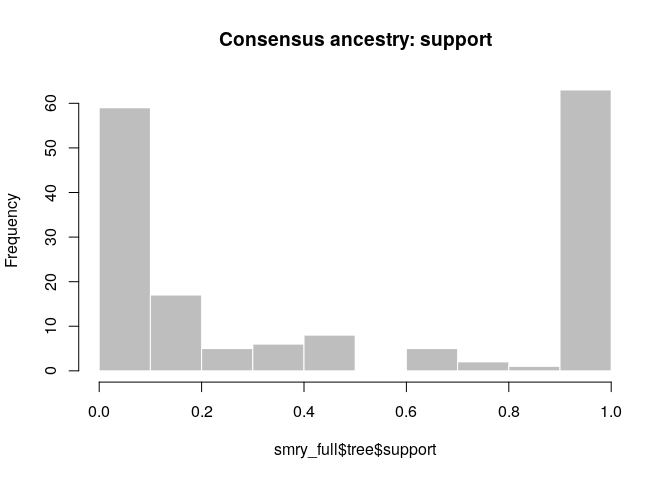
How would you interpret the results? Compare the results to those using temporal data only, or temporal and genetic data. Can we always rely on contact data to estimate who infected whom?
- Contact data clearly resolves additional transmission pairs
- However, we only have 59 contacts in an outbreak of ~160 cases; many ancestries remain unresolved
- The network plot shows the same results; we still have clusters of genetically identical cases with no contact data to further resolve them
- Infection times estimates have not improved much; we haven’t integrated information on the timing of contacts to improve these estimates
- Contact data will not always be informative of transmission events:
- in a very mixed group of people (i.e. a classroom where all children have been in contact with each other), many contacts exist between non-transmission pairs; this makes the contact data less ‘specific’ to transmission events
- for diseases with long incubation periods, it can be difficult to narrow down when infection occured and know which contacts are epidemiologically relevant
- contact tracing is resource intensive and can be inaccurate (e.g. people giving false information); quality and quantity of the data is not always assured
Now make a new epicontacts object to visualise the consensus tree with
meta-information. First convert the index labels in the consensus tree
to the case IDs in linelist. Also include the estimated infection time
from the consensus tree (smry_full$tree$time).
## match index labels to case IDs
smry_full$tree$from <- linelist_clean$case_id[smry_full$tree$from]
smry_full$tree$to <- linelist_clean$case_id[smry_full$tree$to]
## convert infection time estimates from integers to dates
linelist_clean$t_inf_est <- as.Date(smry_full$tree$time,
origin = min(linelist_clean$date_of_onset))
cons_tree <- make_epicontacts(linelist_clean,
smry_full$tree,
directed = TRUE)In the following, we create color palettes which will be used to display information on the final graph:
support_pal <- colorRampPalette(
c("#918D98", "#645877", "#423359", "#281449", "#1A0340")
)
outcome_pal <- colorRampPalette(
c("#3288BD", "#ABDDA4")
)Looking carefully at the documentation of vis_epicontacts, try to
reproduce the final consensus tree
below:
epicontacts can now also display timed transmission trees using the
method = 'ttree' argument. In the interactive plot below, the colour
of the edges represents the posterior support, the color of the nodes
the outcome, the size of the nodes individual reproductive number
Ri.
Try adjusting the height and width arguments so the tree is cleary
visible, then explore clusters of infection by zooming in and out and
moving the tree around. Drag nodes around to improve clarity if need be.
Hover your mouse over the nodes to get more information, single-click on
a node to highlight its subtree and double-click on a node to collapse
it. Set ttree_shape = 'rectangle' if you want a tree with right-angled
edges. For more info, see ?vis_ttree.
q <- plot(cons_tree,
method = 'ttree', ## show timed tree
x_axis = 't_inf_est', ## use 't_inf_est' column for x_axis
edge_color = "support", ## color edges by posterior support
edge_col_pal = support_pal, ## specify color palette
node_size = 'R_i', ## node size reflects R_i
## edge_label = "support", ## not showing for readability
## node_shape = "gender", ## not showing for readability
## shapes = c(m = "male", f = "female"), ## specify shapes
width = 1000, ## adjust to improve readability
height = 1500, ## adjust to improve readability
node_color = "outcome", ## color nodes by outcome
hide_labels = TRUE, ## don't show node labels
date_labels = "%d/%m", ## formatting date labels
axis_type = 'double', ## show two axes
col_pal = outcome_pal, ## specify color palette
node_order = 'subtree_size', ## order nodes vertically by subtree size
reverse_node_order = TRUE, ## put large subtrees as the bottom
ttree_shape = 'branching' ##
)
qAre there any conclusions can you draw from these figures?
- Perhaps some evidence for superspreading events (e.g. 11f8ea, 9f6884, 0f58c4, f547d6); these largely capture the patterns we saw in the contact data
- No noticeable correlation with recovery status or gender (you can check this by colouring by gender or setting the shape to gender)
Now plot the consensus tree, but only including links with more than 30% posterior support:
r <- plot(cons_tree[, cons_tree$contacts$support > 0.3],
method = 'ttree', ## show timed tree
x_axis = 't_inf_est', ## use 't_inf_est' column for x_axis
edge_color = "support", ## color edges by posterior support
edge_col_pal = support_pal, ## specify color palette
node_size = 'R_i', ## node size reflects R_i
## edge_label = "support",## not showing for readability
## node_shape = "gender", ## not showing for readability
## shapes = c(m = "male", f = "female"), ## specify shapes
width = 1000, ## adjust to improve readability
height = 1500, ## adjust to improve readability
node_color = "outcome", ## color nodes by outcome
hide_labels = TRUE, ## don't show node labels
date_labels = "%d/%m", ## formatting date labels
axis_type = 'double', ## show two axes
col_pal = outcome_pal, ## specify color palette
unlinked_pos = 'middle', ## show unlinked nodes in the middle
root_order = 't_inf_est', ## order roots by time of infection
reverse_root_order = TRUE ## show earliest nodes at the top
)
rDo you think we can reliably answer the question of who infected whom in this outbreak? How can we improve our estimates?
- Though support for some ancestries is high, the overall outbreak is still not very well resolved — Especially the more recent cases are poorly resolved, which are of the most interest
- More contact data would be useful (currently only have 60 reported contacts, whereas we already have genetic data and dates of sampling for all cases)
- Integrate other types of data (i.e. location, covariates such as age, gender, occupation, etc.)